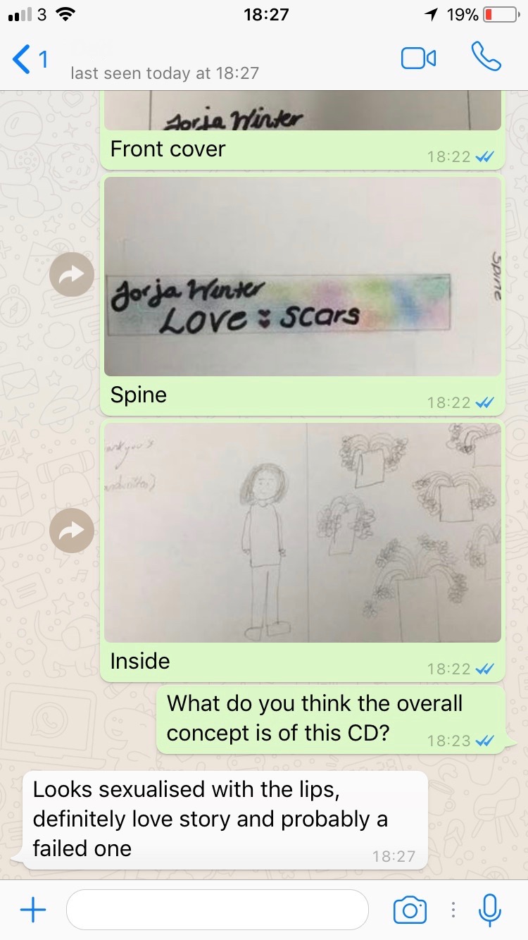
After reading this feedback about the Digipack, it is reassuring to hear that the target audience has understood the overall concept of the CD cover and what it is that we are trying to get across to the audience.
Thursday, 14 December 2017
Mag Ad feedback
After reading this feedback, we need to consider making sure that the image is completely clear. This means that as soon as the audience sees it, they are aware of what the image is. There was a lot of comments about the amount of white space, i think this is something that can also be changed. For instance, we can think about the colour scheme so that any places which are empty are filled with the coloured background.
Wednesday, 13 December 2017
Tuesday, 12 December 2017
Magazine Ad
This is our plan for our magazine advert. We have chosen this as it can be related back to the album cover that we designed, creating the relationship between the magazine advert and the album. By doing this, we are also making the album more recognisable to the audience, promoting the album to a wider range of audiences.
This is my original idea for a digipack. I have considered what I have seen from other artists and bands in the indie-pop genre and I have considered what codes and conventions makes them stand out to the target audience. I have decided to use half of the artists face on the front of the magazine ad. Multiple magazine adverts that I have looked at have this aspect. I have also decided to put the name of the album in the centre of the ad, as well as making it stand out to the audience. This is typical convention of indie-pop magazine ads and this would also make it stand out. The use of pastel colours to fill the base of the magazine ad may also meet the audiences expectations of what should be included in promoting an album.
Monday, 11 December 2017
Work in progess
We have completed stages up to completing our design for our digi-pack. This has allowed us to have a better idea of how we are going to promote our music genre and song to our target audience. As well as this, audience feedback has allowed us to improve our music video in order to be able to effectively meet audiences expectations of a music video in our indie-pop genre.
Friday, 8 December 2017
Brand identidy - digipack
Front cover
For our front cover of our album, we have decided to use an extreme close up with the name of the album: 'LoveScars'. We decided to put the name of the album on the lips, allowing it to stand out and make a statement to our audience about what is involved. We have also decided on having the artists name on the front cover. This is a general convention that comes across in the majority of albums.
Spine of album
For the spine of the album, we have chosen to have the name of the artist and band. We have chosen to incorporate the pastel colours that someone may expect to see on the cover/spine of an album cover. This also makes the CD cover stand out.
Inner left and inner right covers
For the inner left cover of our album, we have decided to put the 'thank you' message from the artist. Here, we are planning on using a hand written style note, as it gives off a more of a personal feel to the album. As well as this, we have chosen to reference the song: 'Satisfied', into the inside cover. For this, we have chosen to use flowers in order to refer back to the song and the fact that we used flowers in the music video:
Back cover
For the back cover, we have decided to use the same image as on the magazine advert, of a back with a heart shape made out of scars. This relates to the album title 'LoveScars' and pulls the whole piece together, as well as linking back to the song.
Magazine Advert
This is our final plan for our magazine advert. We have decided to use the name of the album across the centre of the magazine ad, targeting the audience and making the album stand out. As well as this, we decided to use the same image that we will use on the back of the album cover in order to connect the two elements of the digi-pack. The artists name has been placed over the top of the album cover, creating it to stand out and make the audience interested. The record label and release date has also been put in the magazine ad in order to increase promotion.
We have chosen to use pastel colours which is a code and convention of the indie-pop genre. This is beneficial as it highlights to the audience the genre of the music video.
Subscribe to:
Posts (Atom)
-
Evaluation question 3 what have you learned from Charlotte Keane


