Showing posts with label Research. Show all posts

Friday, 15 December 2017

Target Audience feedback

For our social media feedback, I asked members of our target audience to answer these questions:


1) What do you think of our music video?
2) What editing do you think if the most effective to our target audience?
3) As a member of our target audience do you think that our digipack and magazine ad meet the codes and conventions that you would expect from a album in the indie-pop genre.


From this feedback from our target audience, we have been able to see which elements of our video, digipack and magazine ad they like. This has also allowed us to see which elements that they think that need improving in order to meet their expectations.


Thursday, 14 December 2017

Digipack feedback


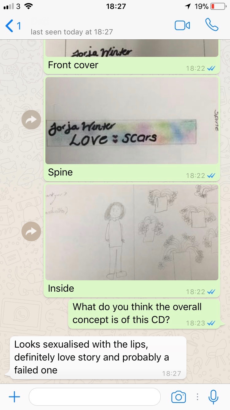
After reading this feedback about the Digipack, it is reassuring to hear that the target audience has understood the overall concept of the CD cover and what it is that we are trying to get across to the audience. 

Mag Ad feedback

After reading this feedback, we need to consider making sure that the image is completely clear. This means that as soon as the audience sees it, they are aware of what the image is. There was a lot of comments about the amount of white space, i think this is something that can also be changed. For instance, we can think about the colour scheme so that any places which are empty are filled with the coloured background.

Tuesday, 12 December 2017

Magazine Ad

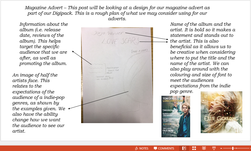
This is our plan for our magazine advert. We have chosen this as it can be related back to the album cover that we designed, creating the relationship between the magazine advert and the album. By doing this, we are also making the album more recognisable to the audience, promoting the album to a wider range of audiences.


This is my original idea for a digipack. I have considered what I have seen from other artists and bands in the indie-pop genre and I have considered what codes and conventions makes them stand out to the target audience. I have decided to use half of the artists face on the front of the magazine ad. Multiple magazine adverts that I have looked at have this aspect. I have also decided to put the name of the album in the centre of the ad, as well as making it stand out to the audience. This is typical convention of indie-pop magazine ads and this would also make it stand out. The use of pastel colours to fill the base of the magazine ad may also meet the audiences expectations of what should be included in promoting an album.


Friday, 8 December 2017

Brand identidy - digipack

Front cover


For our front cover of our album, we have decided to use an extreme close up with the name of the album: 'LoveScars'. We decided to put the name of the album on the lips, allowing it to stand out and make a statement to our audience about what is involved. We have also decided on having the artists name on the front cover. This is a general convention that comes across in the majority of albums.


Spine of album

For the spine of the album, we have chosen to have the name of the artist and band. We have chosen to incorporate the pastel colours that someone may expect to see on the cover/spine of an album cover. This also makes the CD cover stand out.


Inner left and inner right covers
For the inner left cover of our album, we have decided to put the 'thank you' message from the artist. Here, we are planning on using a hand written style note, as it gives off a more of a personal feel to the album. As well as this, we have chosen to reference the song: 'Satisfied', into the inside cover. For this, we have chosen to use flowers in order to refer back to the song and the fact that we used flowers in the music video:


Back cover

For the back cover, we have decided to use the same image as on the magazine advert, of a back with a heart shape made out of scars. This relates to the album title 'LoveScars' and pulls the whole piece together, as well as linking back to the song.


Magazine Advert


This is our final plan for our magazine advert. We have decided to use the name of the album across the centre of the magazine ad, targeting the audience and making the album stand out. As well as this, we decided to use the same image that we will use on the back of the album cover in order to connect the two elements of the digi-pack. The artists name has been placed over the top of the album cover, creating it to stand out and make the audience interested. The record label and release date has also been put in the magazine ad in order to increase promotion.
We have chosen to use pastel colours which is a code and convention of the indie-pop genre. This is beneficial as it highlights to the audience the genre of the music video.

Magazine Ad Design

Here, we have considered different ideas for what our magazine advert could be for our Digipack, in order to find how to most promote the album cover.


Font Analysis

On this Prezi, we have considered what fonts most fit with the indie-pop genre. This has then allowed us to effectively compare which fonts would most suit our Digipack album cover, as well as most fitting with the genre of the music video.

Analysis of magazine adverts in the indie-pop genre


Sunday, 3 December 2017

CD Covers


This is the album cover for the band 'Earth Wind and Fire'. This cover stood out to me as it is bold and makes a statement towards the audience. This also stood out to me because of the idea of religion that it holds. The use of bright lights and praise symbols, such as the artists arms raised and the use of powerful animals pointing to the bold colour highlights the nature of the cover.
The album cover very much meets the audiences expectations as Earth, Wind and Fire use very bold and very colourful, much like the album cover. As well as this, the band have the name of the album and the name of the band on the front cover of the case.


Hozier's album cover looks at different aspects of colour and unusual creativity. Hozier's album cover consistently uses similar colours through out the cover, especially over the middle two compartments of the case, following the idea of natural beauty. The front of the case still uses similar colours of orange and black to the middle two compartments of the case. However, it also uses the idea of having no identity, shown by the lack of the characters face with this linking to the audiences expectations of not using the artists face in the music videos or the album cover. 


The Queens of the Stone Age album cover links back to the title of the album 'Villains'. The title of the album links back to the use of the devil on the cover relates to the idea that villains control choices and decisions made, However, the use of religious imagery contradicts this idea as it opposes the classical idea of what a villain is portrayed like.
As well as this, the choice in colours that have been selected, red and black, for the album cover places more connotations of the name of the album which is significant when trying to reach the specific target audience.


Target Audience feedback


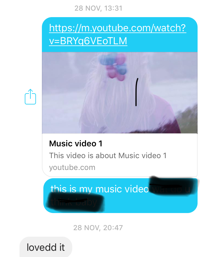
Members of our target audience said what they thought of the music video. From this feedback, our target audience have generally really enjoyed what we have created. This has been beneficial as it has given us the knowledge that it has met the expectations of our target audience. We have a range of feedback from different social media sites including; Whatsapp, Snapchat, Instagram and Facebook.


Analysing CD covers

 I went into HMV recently in order to find current up to date CD covers and analyse what characteristics they have in order to make them stand out. I took pictures of three CD covers (Front and back). 


ISSA- By 21 Savage
Immediately from looking at the front cover of this album, it uses the colour pink as it is quite bright and vibrant in order to attract an audience member towards it. The cartooned effect of the cover makes it aesthetically pleasing and more appealing to their target audience of people aged 16-25. The artist's image is represented through the use of chains around his neck, money that is seen on the front and back of the album and the tattoos that the artist has on his body. 

 Everybody- By Logic
This album cover stood out to me because from a far, you look at the album and see that it looks very similar to that of the "Wedding at Cana" by Paolo Veronese. The painting inspired the idea for his next album cover, in which he wanted to show all different people together sharing a meal, his family, friends, neighbours, co workers, girlfriends, Exes, dogs and robots. This would explain the name, "Everybody". The font on the back of the album cover compliments this idea, as it is a style that replicates the writing that would have been used in important documents and scrolls in the time period that the original picture was set in.
 Youth- By Tinie Tempah
This album provides some context to it. The title 'Youth' suggests childhood. This would suggest that the album has something to do with Tinie Tempah's upbringing and making him into the person that he is now. On the front of the album he can be seen sitting next to a small boy who is wearing similar clothing and has the same hair style as him, this suggests that that was him when he was younger. In the background of the front cover, flats can be seen and this would most likely be where he grew up. The font on the back of the album is small and it has been placed at the bottom so that the image underneath can still be clearly seen.


The best of STING- fields of gold album
This has a simplistic colour scheme which has connotations of a bee which would be playing on their name 'Sting'. This connotation is apparent from the use of yellow and black colours throughout. The front and back of the album both show a side of his face but when the cover is opened, it becomes clear what that the two sides of his face make an image of his whole face when put together. The font style is thin and not very bold and there is nothing that makes it out of the ordinary.


Lungs- By Florence + the machine
The artwork on this album is really creative and it fits with her indie pop genre of her music. As the title of the album is 'Lungs' that is the continuous theme throughout the artwork. On the front cover, lungs are used as a prop that can be seen outside of her body to highlight their importance and delicacy. The delicate theme is also shown through the chosen typography as the font appears in a handwritten style and is in a white colour which symbolises purity. The second image (on the left once you open the CD cover) shows Florence in a wilder manner and how connected she is to her audience at shows as she gets involved with the crowd. The actual CD shows two hands which look like a set of lungs. This concept shows the mechanics behind lungs and that without them we wouldn't be alive. The back of the CD cover shows a diagram of the lungs, it appears to be numbering what the different parts of the lungs are but it is actually just listing the songs, this is a really clever idea and it would definitely draw in the audiences' attention. 


Music Video