Friday, 8 December 2017
Magazine Ad Design
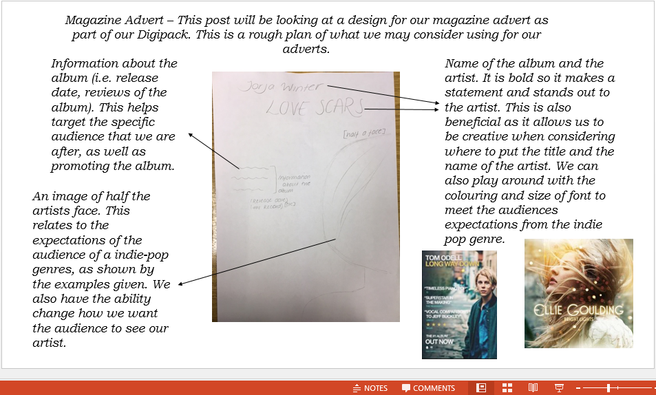
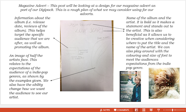
Here, we have considered different ideas for what our magazine advert could be for our Digipack, in order to find how to most promote the album cover.

Magazine advert discussion
In this video we discussed our initial designs for the magazine advert. We have decided to go with Neamh's design of the image showing the artists back with scars on it. This photo is the same as the photo which is on the back of our digipack. This is a convention that many artist use and it will create a sense of familiararity for our audience. The font and colours we have decided to use are very bright and colourful which will draw in the audience as their eyes will be initially drawn to the magazine advert. The audience still get a sense of the overall concept of the song through the name of the album and the photo on the magazine advert. The name is 'Love scars' and this is clearly shown through the scars in the shape of a love heart on the back of the artist.
Font Analysis
On this Prezi, we have considered what fonts most fit with the indie-pop genre. This has then allowed us to effectively compare which fonts would most suit our Digipack album cover, as well as most fitting with the genre of the music video.

Thursday, 7 December 2017

Wednesday, 6 December 2017


Brand identity- Digipack
The artist is called Jorja Winter. The decisions we have made regarding colour include, We have decided to use pastel colours which we though would fit in with our genre of indie-pop, therefore reflecting the genre. The overall concept of the album is about love, loss and heartbreak, which is why we have decided to call it 'Love Scars'. We will show this through the images and fonts we use on the digipack. It links to our audience as it will appeal to listeners of the indie-pop genre, as they should be able to recognise straight away what the genre is as it would be similar to what they are familiar with. The audience would be sympathetic of the artist as they would be seeing them in a negative light as they are heartbroken and destroyed. The artist is essentially stripped back and the audience can see their true colours. The genre is shown through the use of conceptual pictures and not specifically people, this is typical of the indie-pop genre as the images we see as audience members sometimes are not what we would expect and they are slightly alternative. The codes and conventions that we will use are a symbol of our record label, NC records, the artists name on the front and spine, we will also include a barcode on the back to make the product appear more professional. This will link to our other two products as the music video is a song about love and loss and this fits in with the album concept and title 'Love Scars'.
Subscribe to:
Posts (Atom)

-
Evaluation question 3 what have you learned from Charlotte Keane

