Showing posts with label Planning. Show all posts

Friday, 15 December 2017

Target Audience feedback

For our social media feedback, I asked members of our target audience to answer these questions:


1) What do you think of our music video?
2) What editing do you think if the most effective to our target audience?
3) As a member of our target audience do you think that our digipack and magazine ad meet the codes and conventions that you would expect from a album in the indie-pop genre.


From this feedback from our target audience, we have been able to see which elements of our video, digipack and magazine ad they like. This has also allowed us to see which elements that they think that need improving in order to meet their expectations.


Thursday, 14 December 2017

Digipack feedback


After reading this feedback about the Digipack, it is reassuring to hear that the target audience has understood the overall concept of the CD cover and what it is that we are trying to get across to the audience. 

Mag Ad feedback

After reading this feedback, we need to consider making sure that the image is completely clear. This means that as soon as the audience sees it, they are aware of what the image is. There was a lot of comments about the amount of white space, i think this is something that can also be changed. For instance, we can think about the colour scheme so that any places which are empty are filled with the coloured background.

Tuesday, 12 December 2017

Magazine Ad

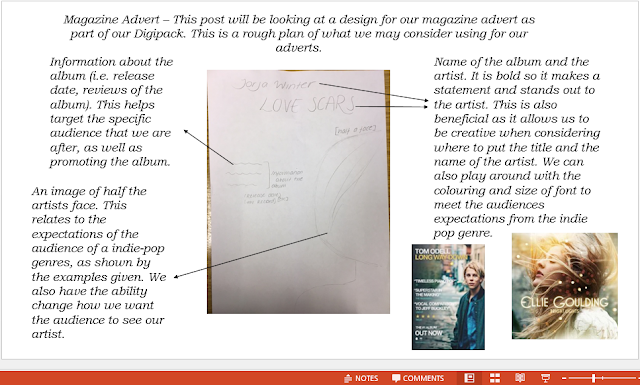
This is our plan for our magazine advert. We have chosen this as it can be related back to the album cover that we designed, creating the relationship between the magazine advert and the album. By doing this, we are also making the album more recognisable to the audience, promoting the album to a wider range of audiences.


This is my original idea for a digipack. I have considered what I have seen from other artists and bands in the indie-pop genre and I have considered what codes and conventions makes them stand out to the target audience. I have decided to use half of the artists face on the front of the magazine ad. Multiple magazine adverts that I have looked at have this aspect. I have also decided to put the name of the album in the centre of the ad, as well as making it stand out to the audience. This is typical convention of indie-pop magazine ads and this would also make it stand out. The use of pastel colours to fill the base of the magazine ad may also meet the audiences expectations of what should be included in promoting an album.


Monday, 11 December 2017

Work in progess

We have completed stages up to completing our design for our digi-pack. This has allowed us to have a better idea of how we are going to promote our music genre and song to our target audience. As well as this, audience feedback has allowed us to improve our music video in order to be able to effectively meet audiences expectations of a music video in our indie-pop genre.


Friday, 8 December 2017

Brand identidy - digipack

Front cover


For our front cover of our album, we have decided to use an extreme close up with the name of the album: 'LoveScars'. We decided to put the name of the album on the lips, allowing it to stand out and make a statement to our audience about what is involved. We have also decided on having the artists name on the front cover. This is a general convention that comes across in the majority of albums.


Spine of album

For the spine of the album, we have chosen to have the name of the artist and band. We have chosen to incorporate the pastel colours that someone may expect to see on the cover/spine of an album cover. This also makes the CD cover stand out.


Inner left and inner right covers
For the inner left cover of our album, we have decided to put the 'thank you' message from the artist. Here, we are planning on using a hand written style note, as it gives off a more of a personal feel to the album. As well as this, we have chosen to reference the song: 'Satisfied', into the inside cover. For this, we have chosen to use flowers in order to refer back to the song and the fact that we used flowers in the music video:


Back cover

For the back cover, we have decided to use the same image as on the magazine advert, of a back with a heart shape made out of scars. This relates to the album title 'LoveScars' and pulls the whole piece together, as well as linking back to the song.


Magazine Advert


This is our final plan for our magazine advert. We have decided to use the name of the album across the centre of the magazine ad, targeting the audience and making the album stand out. As well as this, we decided to use the same image that we will use on the back of the album cover in order to connect the two elements of the digi-pack. The artists name has been placed over the top of the album cover, creating it to stand out and make the audience interested. The record label and release date has also been put in the magazine ad in order to increase promotion.
We have chosen to use pastel colours which is a code and convention of the indie-pop genre. This is beneficial as it highlights to the audience the genre of the music video.

Individual ad design- Post creator


Magazine Ad Design

Here, we have considered different ideas for what our magazine advert could be for our Digipack, in order to find how to most promote the album cover.


Magazine advert discussion


In this video we discussed our initial designs for the magazine advert. We have decided to go with Neamh's design of the image showing the artists back with scars on it. This photo is the same as the photo which is on the back of our digipack. This is a convention that many artist use and it will create a sense of familiararity for our audience.  The font and colours we have decided to use are very bright and colourful which will draw in the audience as their eyes will be initially drawn to the magazine advert. The audience still get a sense of the overall concept of the song through the name of the album and the photo on the magazine advert. The name is 'Love scars' and this is clearly shown through the scars in the shape of a love heart on the back of the artist.

Font Analysis

On this Prezi, we have considered what fonts most fit with the indie-pop genre. This has then allowed us to effectively compare which fonts would most suit our Digipack album cover, as well as most fitting with the genre of the music video.

Analysis of magazine adverts in the indie-pop genre


Wednesday, 6 December 2017

Analysis of magazine adverts


Brand identity- Digipack


The artist is called Jorja Winter. The decisions we have made regarding colour include, We have decided to use pastel colours which we though would fit in with our genre of indie-pop, therefore reflecting the genre. The overall concept of the album is about love, loss and heartbreak, which is why we have decided to call it 'Love Scars'. We will show this through the images and fonts we use on the digipack. It links to our audience as it will appeal to listeners of the indie-pop genre, as they should be able to recognise straight away what the genre is as it would be similar to what they are familiar with. The audience would be sympathetic of the artist as they would be seeing them in a negative light as they are heartbroken and destroyed. The artist is essentially stripped back and the audience can see their true colours. The genre is shown through the use of conceptual pictures and not specifically people, this is typical of the indie-pop genre as the images we see as audience members sometimes are not what we would expect and they are slightly alternative. The codes and conventions that we will use are a symbol of our record label, NC records, the artists name on the front and spine, we will also include a barcode on the back to make the product appear more professional. This will link to our other two products as the music video is a song about love and loss and this fits in with the album concept and title 'Love Scars'.


Tuesday, 5 December 2017

Digipack design

 Below shows two images, the first one is the front and back cover of the Digipack. This is what you would see if you were to open it and lay it down on the table with the front and back facing upwards. In this image the left side shows half of a male's body. He is in a busy area with cars driving past him as he walks on the pavement. On the right hand side it shows the opposite side of the women's body and she is looking out on a rooftop onto a city and the sun can be seen setting in the distance. This is meant to show two different perspectives, one is amongst the chaos and another is looking from a far. They are both positioned that if you look at the images separately two pictures are seen but once put together, the male and female make up one body in the centre.

This is the inside of the digipack, along the spine, "Balcony- satisfied" can be read, this would be more visible on outside of the digipack as the inside would be only a reverse of what is seen. i have added it to this design instead to allow for the full effect of the design shown above. On the left of the design that is seen below, the writing "Satisfied Balcony" with a music note can be seen on top of a drain cover. on the right, two arms are extended out to be holding hands, this will only be truly visible  once the CD is removed, however you will still be able to see the arms reaching out when the CD is in place. 

CD Cover analysis


We looked at a range of different album covers and considered what elements makes them most effective when reaching their specific target audiences. This then allowed us to consider what codes and conventions other artists have used to meet their audiences expectations.

Monday, 4 December 2017

CD Planning


After listening to the song, we considered what elements should be considered when designing the CD case for our song, most fitting the indie-pop genre of the music video.

Brain dump


This is an example of a 'Brain dump'. This is essentially what comes to mind when our chosen song is listened too. The page includes key lyrics, emotions, moods, ideas and concepts.

Sunday, 3 December 2017

CD Covers


This is the album cover for the band 'Earth Wind and Fire'. This cover stood out to me as it is bold and makes a statement towards the audience. This also stood out to me because of the idea of religion that it holds. The use of bright lights and praise symbols, such as the artists arms raised and the use of powerful animals pointing to the bold colour highlights the nature of the cover.
The album cover very much meets the audiences expectations as Earth, Wind and Fire use very bold and very colourful, much like the album cover. As well as this, the band have the name of the album and the name of the band on the front cover of the case.


Hozier's album cover looks at different aspects of colour and unusual creativity. Hozier's album cover consistently uses similar colours through out the cover, especially over the middle two compartments of the case, following the idea of natural beauty. The front of the case still uses similar colours of orange and black to the middle two compartments of the case. However, it also uses the idea of having no identity, shown by the lack of the characters face with this linking to the audiences expectations of not using the artists face in the music videos or the album cover. 


The Queens of the Stone Age album cover links back to the title of the album 'Villains'. The title of the album links back to the use of the devil on the cover relates to the idea that villains control choices and decisions made, However, the use of religious imagery contradicts this idea as it opposes the classical idea of what a villain is portrayed like.
As well as this, the choice in colours that have been selected, red and black, for the album cover places more connotations of the name of the album which is significant when trying to reach the specific target audience.


Wednesday, 29 November 2017

Actors


We chose Sarah as our female actor because she reflects the Indie-pop genre as she has a similar look to other artists from that genre, for example Birdy who is seen on the right who produces music from the same genre. Sarah had also done Media studies herself at Fulbrook school in Woking, we found that this would be an advantage as she was aware of the amount of availability she would need to have and what it takes to produce the media products. This meant that she had experience with camera angles, lip-syncing and retaking shots.


We chose Archie as our male actor as he too also reflected other artists from the genre of Indie-pop. Archie had also done Media Studies at Godalming College in Godalming which meant that he also had experience with the subject and what was needed in order to make the product look good. He also had a lot of flexibility with filming and therefore made the experience a lot more organised. 

Tuesday, 28 November 2017

Rough cut feedback


Overall the lip syncing was rated quite highly and that is a really positive response as it can be very challenging trying to get the lip syncing to match the audio from the original song. We used a range of camera movements such as: extreme close ups, panning, handheld camera shots, mid and long shots and focus pulls. Our editing techniques consisted of layering, colour isolation, colour effects, slowed down and sped up shots. The framing and the controlled movement of the camera was rated positively in all of the feedback. The writing on the whiteboard effect worked really well as it was perfectly in time with the lyrics and the feedback shows that the audience responded positively to this

The negative feedback we received will help to influence us as to what we can do to improve on our music video. The genre of our video seemed to be unclear from the audience as they choice either narrative or concept. This was not entirely wrong as it is a narrative video with concept aspects. A big part of the video that we need to work on is the creativeness of both characters costumes and makeup as they don't appear to have anything out of the ordinary and it is all very simple and plain. This is something that does fit in with our genre, however, it would be excellent if we could incorporate some more into our video. There is one shot where the female character is sitting on a bridge, this shot is far too long and there is no editing effects to make it more interesting, we may need to shoot more footage in order to make this appear more interesting. The shot of the two characters in the mirror using each others reflection is a creative concept, however it could be done better through the use of editing rather than camera deception. This means that it will take more practise, filming time and editing in order to do this although the final product should be a good representation of these efforts. 

Music Video