Showing posts with label Charlotte. Show all posts
Showing posts with label Charlotte. Show all posts
Thursday, 8 March 2018
Wednesday, 7 March 2018

Tuesday, 6 March 2018


Sunday, 31 December 2017
Friday, 29 December 2017
Thursday, 28 December 2017
Friday, 15 December 2017
Target Audience Feedback Magazine Ad
By receiving feedback from members of our target audience, we were able to see what elements of our target audience think are the most and least creative about our magazine ad. From this, we are now able to make improvements to the magazine ad to improve it, as well as meeting the audiences expectations.


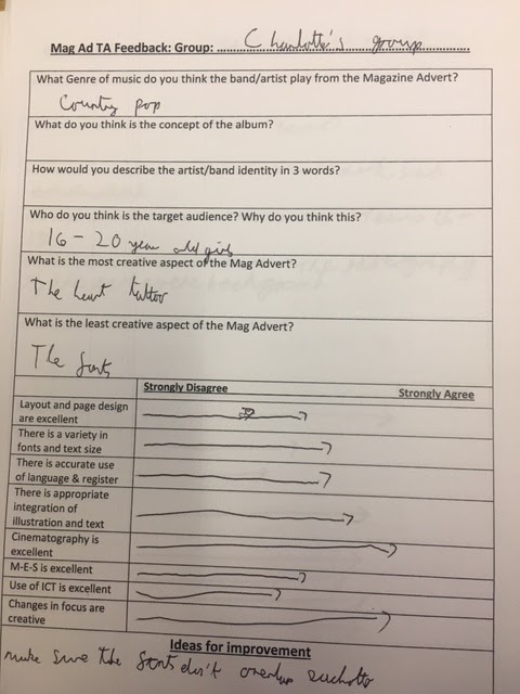


It is important for us to consider our target audiences feedback as it is them that we are trying to sell our artist to. With this, we are able to consider how we can improve our magazine in order to promote this to our target audience.
Work in Progress
This is our the inside right for our album cover. We have chosen to take this side of our album cover for 'thank you's' for the people involved with the creation of the album. Here we have chosen to use this image as we are trying to sell the artist to the audience.


Work in progress
 We have started to create our digipack and magazine ad and learning new techniques in order to produce an effective piece.
Target Audience feedback
For our social media feedback, I asked members of our target audience to answer these questions:
1) What do you think of our music video?
2) What editing do you think if the most effective to our target audience?
3) As a member of our target audience do you think that our digipack and magazine ad meet the codes and conventions that you would expect from a album in the indie-pop genre.


1) What do you think of our music video?
2) What editing do you think if the most effective to our target audience?
3) As a member of our target audience do you think that our digipack and magazine ad meet the codes and conventions that you would expect from a album in the indie-pop genre.


From this feedback from our target audience, we have been able to see which elements of our video, digipack and magazine ad they like. This has also allowed us to see which elements that they think that need improving in order to meet their expectations.
Tuesday, 12 December 2017
Magazine Ad

This is my original idea for a digipack. I have considered what I have seen from other artists and bands in the indie-pop genre and I have considered what codes and conventions makes them stand out to the target audience. I have decided to use half of the artists face on the front of the magazine ad. Multiple magazine adverts that I have looked at have this aspect. I have also decided to put the name of the album in the centre of the ad, as well as making it stand out to the audience. This is typical convention of indie-pop magazine ads and this would also make it stand out. The use of pastel colours to fill the base of the magazine ad may also meet the audiences expectations of what should be included in promoting an album.

Monday, 11 December 2017
Work in progess
We have completed stages up to completing our design for our digi-pack. This has allowed us to have a better idea of how we are going to promote our music genre and song to our target audience. As well as this, audience feedback has allowed us to improve our music video in order to be able to effectively meet audiences expectations of a music video in our indie-pop genre.


Friday, 8 December 2017
Brand identidy - digipack
Front cover
For our front cover of our album, we have decided to use an extreme close up with the name of the album: 'LoveScars'. We decided to put the name of the album on the lips, allowing it to stand out and make a statement to our audience about what is involved. We have also decided on having the artists name on the front cover. This is a general convention that comes across in the majority of albums.
For our front cover of our album, we have decided to use an extreme close up with the name of the album: 'LoveScars'. We decided to put the name of the album on the lips, allowing it to stand out and make a statement to our audience about what is involved. We have also decided on having the artists name on the front cover. This is a general convention that comes across in the majority of albums.

Spine of album
For the spine of the album, we have chosen to have the name of the artist and band. We have chosen to incorporate the pastel colours that someone may expect to see on the cover/spine of an album cover. This also makes the CD cover stand out.

Inner left and inner right covers
For the inner left cover of our album, we have decided to put the 'thank you' message from the artist. Here, we are planning on using a hand written style note, as it gives off a more of a personal feel to the album. As well as this, we have chosen to reference the song: 'Satisfied', into the inside cover. For this, we have chosen to use flowers in order to refer back to the song and the fact that we used flowers in the music video:


Back cover
For the back cover, we have decided to use the same image as on the magazine advert, of a back with a heart shape made out of scars. This relates to the album title 'LoveScars' and pulls the whole piece together, as well as linking back to the song.

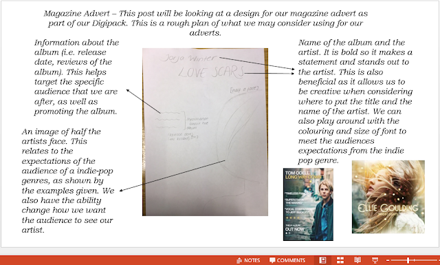
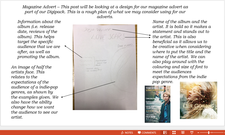
Magazine Advert

This is our final plan for our magazine advert. We have decided to use the name of the album across the centre of the magazine ad, targeting the audience and making the album stand out. As well as this, we decided to use the same image that we will use on the back of the album cover in order to connect the two elements of the digi-pack. The artists name has been placed over the top of the album cover, creating it to stand out and make the audience interested. The record label and release date has also been put in the magazine ad in order to increase promotion.
We have chosen to use pastel colours which is a code and convention of the indie-pop genre. This is beneficial as it highlights to the audience the genre of the music video.
Magazine Ad Design
Here, we have considered different ideas for what our magazine advert could be for our Digipack, in order to find how to most promote the album cover.
Magazine advert discussion
In this video we discussed our initial designs for the magazine advert. We have decided to go with Neamh's design of the image showing the artists back with scars on it. This photo is the same as the photo which is on the back of our digipack. This is a convention that many artist use and it will create a sense of familiararity for our audience. The font and colours we have decided to use are very bright and colourful which will draw in the audience as their eyes will be initially drawn to the magazine advert. The audience still get a sense of the overall concept of the song through the name of the album and the photo on the magazine advert. The name is 'Love scars' and this is clearly shown through the scars in the shape of a love heart on the back of the artist.
Font Analysis
On this Prezi, we have considered what fonts most fit with the indie-pop genre. This has then allowed us to effectively compare which fonts would most suit our Digipack album cover, as well as most fitting with the genre of the music video.

Wednesday, 6 December 2017


Brand identity- Digipack
The artist is called Jorja Winter. The decisions we have made regarding colour include, We have decided to use pastel colours which we though would fit in with our genre of indie-pop, therefore reflecting the genre. The overall concept of the album is about love, loss and heartbreak, which is why we have decided to call it 'Love Scars'. We will show this through the images and fonts we use on the digipack. It links to our audience as it will appeal to listeners of the indie-pop genre, as they should be able to recognise straight away what the genre is as it would be similar to what they are familiar with. The audience would be sympathetic of the artist as they would be seeing them in a negative light as they are heartbroken and destroyed. The artist is essentially stripped back and the audience can see their true colours. The genre is shown through the use of conceptual pictures and not specifically people, this is typical of the indie-pop genre as the images we see as audience members sometimes are not what we would expect and they are slightly alternative. The codes and conventions that we will use are a symbol of our record label, NC records, the artists name on the front and spine, we will also include a barcode on the back to make the product appear more professional. This will link to our other two products as the music video is a song about love and loss and this fits in with the album concept and title 'Love Scars'.
Subscribe to:
Posts (Atom)


